Mobile App Design
Onboarding New Users (7.0 release)
These onboarding screens were a part of the 7.0 release for iOS and Android. The big update in this release was the addition of our new Matchmaker “swipe right” feature.
Below is the iOS flow. The Android flow was virtually identical. Screen size, fonts, form styles, and system modals were all changed to be Android native.
These are the informational screens. Following these screens were the onboarding forms and UI widgets, based on existing design patterns.
To see more of my app design work, please check out my in-depth case studies!
Responsive Web Design
Anti-Ad Blocker
The goal was to convince users to shut off their ad blocking software. The appeal was to put a bit of human face on the company by having some fun, which reflected our actual internal culture as opposed to the brand standards that were the company’s usual public face.
Design-wise, I deliberately broke some of our pattern rules while using other patterns in slightly different ways to keep things casual but still somewhat on-brand.
Tablet modal
Mobile modal
Hero Module Design Pattern
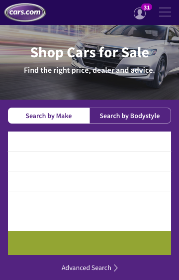
As part of my visual design contribution to the company’s Design Pattern Library, I was tasked to create guidelines for the hero module that appeared at the top of the landing pages on our website. The module usually consisted of a hero photo (sometimes a paid placement), a primary header [H1] and subheader [H2], a call-to-action, an interactive form, or some combination of all five. Custom elements like a “Sponsored” tag were TBD.
For the hero pattern effort, the goal was to create a consistent look and feel across all the landing pages, while maintaining the right balance of imagery and functionality, I wanted to use as much of the existing design patterns as possible, but still have enough flexibility for exceptions that would not break the page.
This included rules for:
Min and max size requirements for hero image
Size and character count for H1 text
Size and character count for H2 text
Rules for placement of the H1 and H2 text to be based on a 9 square grid
Rules for how form widget degrades on smaller devices
Unfortunately, the design team was completely restructured right as this work was being finished and so implementation fell by the wayside.
Desktop home page. Original size: 1170px x 492px
Tablet home page. Original size: 768px x 487px
Mobile home page. Original size: 360px x 562px
Desktop ownership landing page. Original size: 1170px x 408px
Tablet ownership landing page. Original size: 768px x 330px
Mobile ownership landing page. Original size: 360px x 250px
Hero Photo Design Pattern
For the hero photo, the goal was to create a consistent look and feel across all hero imagery, so that no matter the content of the photo, the designer could fulfill the needs of their product, follow existing design patterns, and also not break legibility best practices.
Desktop hero image, dark.
Tablet hero image, dark.
Mobile hero image, dark.
Desktop hero image, light.
Tablet hero image, light.
Mobile hero image, light.


